Brand Design & Marketing
Sports Goods & Performance Training Products

Brand design completed for SKLZ between 2012 and 2015. The direction was provided by the Art Director, and I would institute the style through all the brand marketing needs.
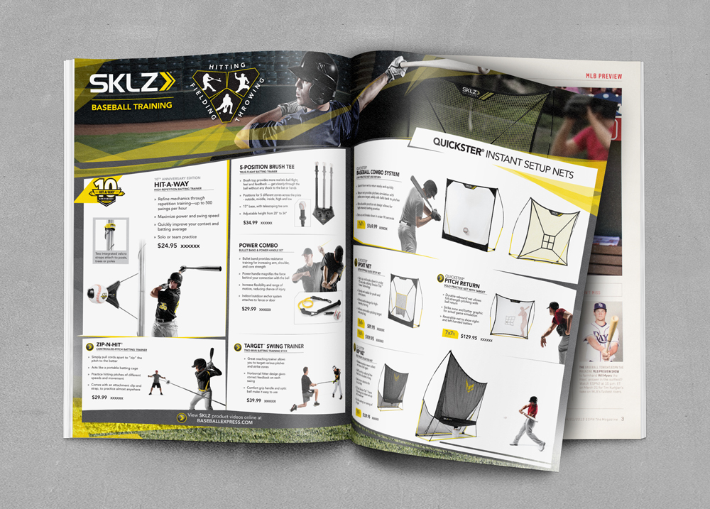
Print Ads
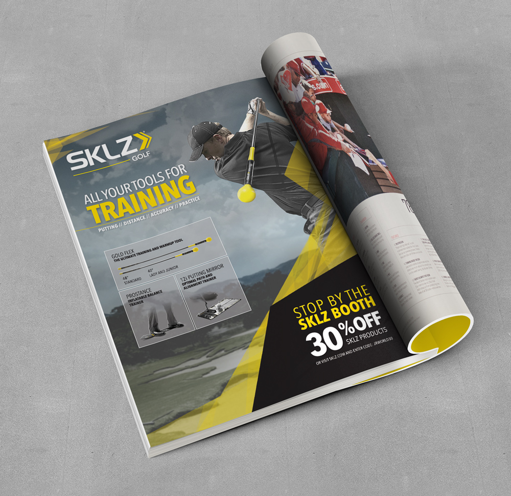
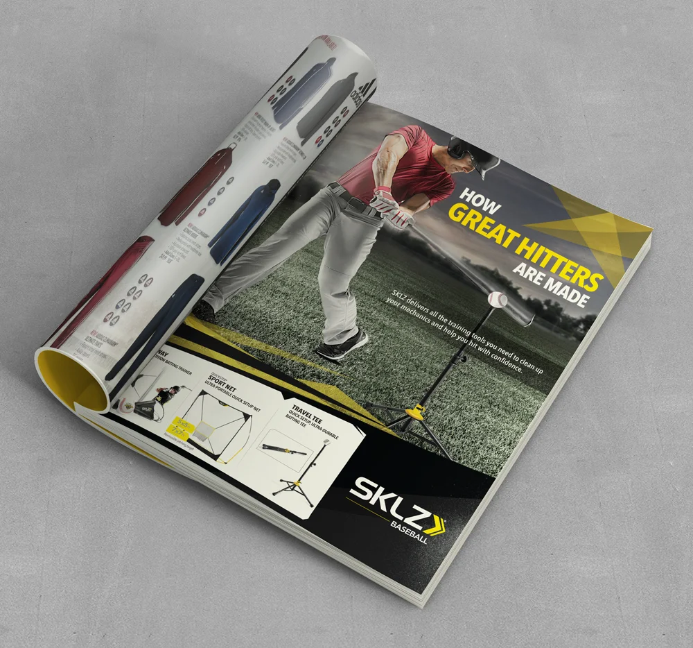
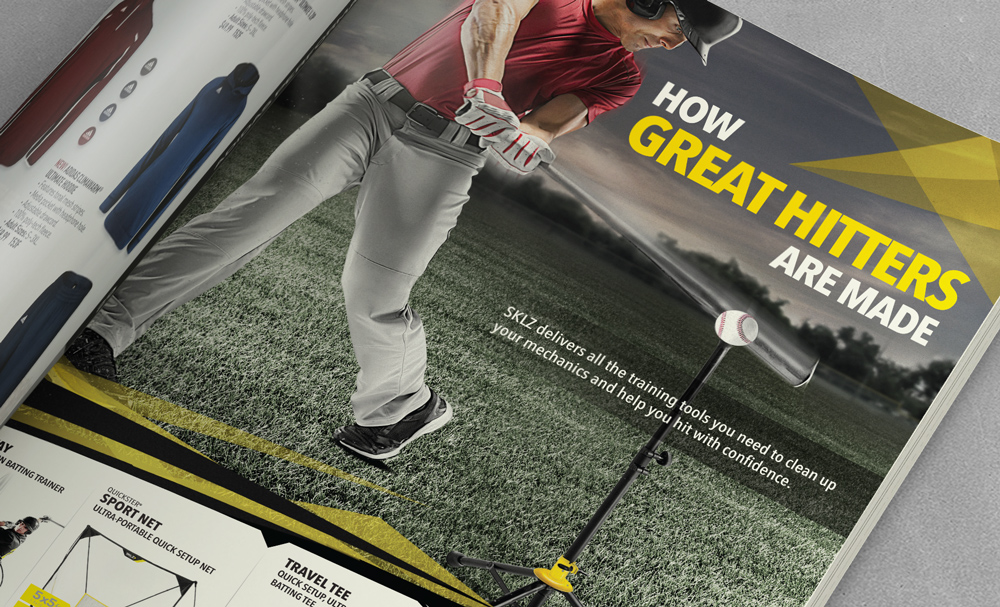
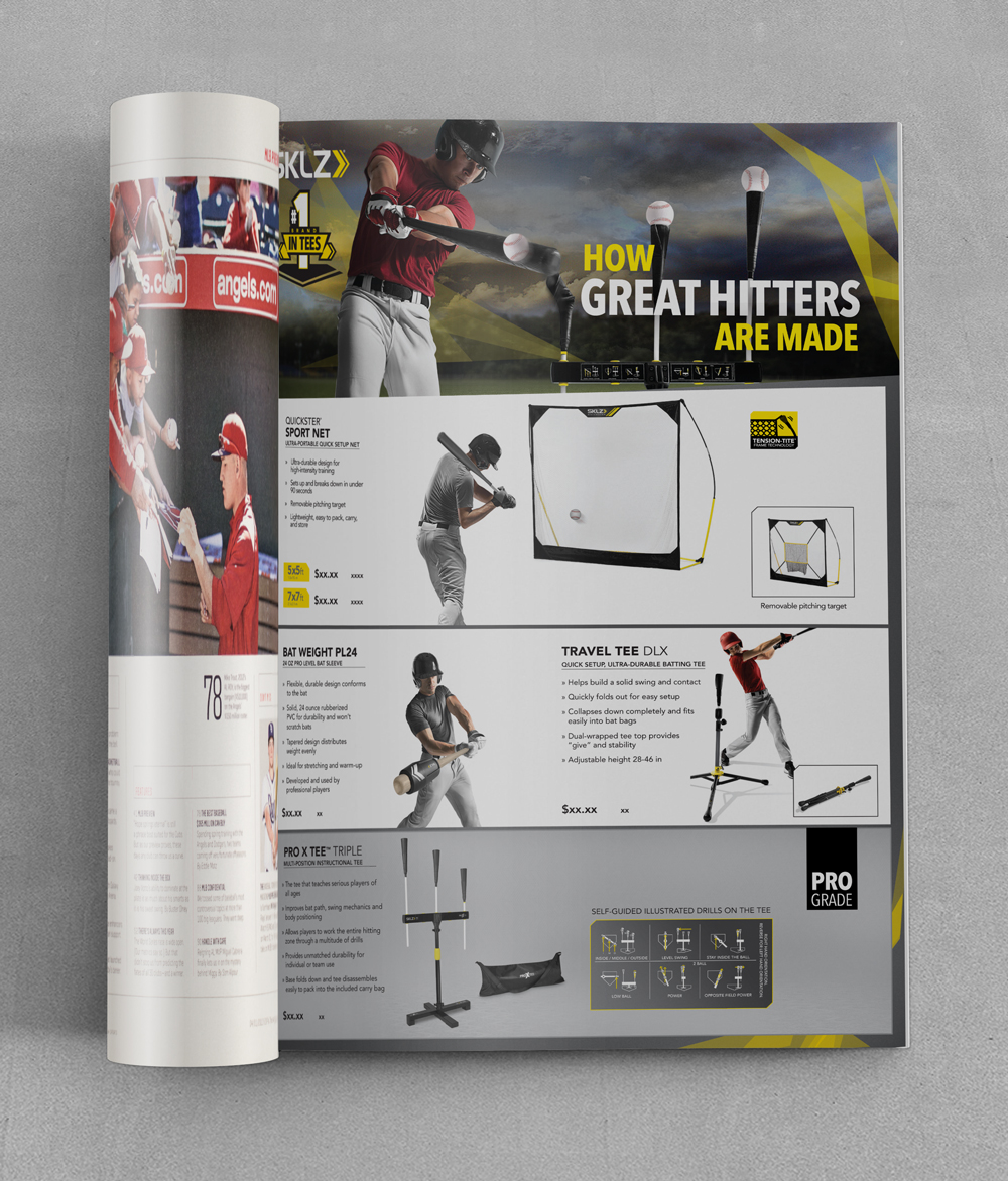
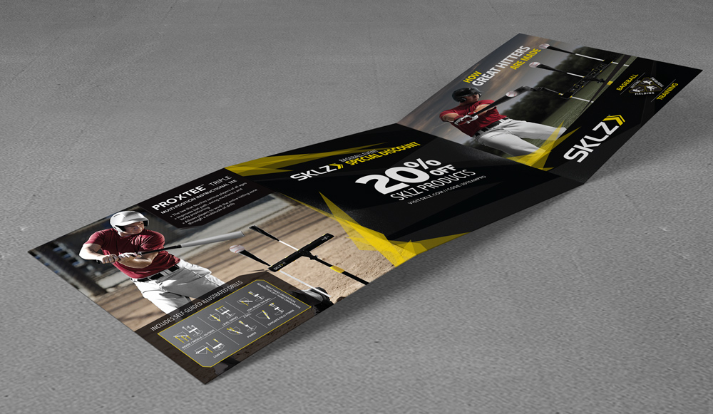
The campaign style for SKLZ for 2013 was using 'fractals'. The campaign story for baseball was based around hitting, 'How Great Hitters Are Made". The campaign story is demonstrated through the athlete shot, product and the headline. These elements are consistent through this brochure, the print ad and retail signage below.
For the style of the campaign, geometric shapes (fractals) were used to accent certain element of a page. The photographic style was also very dramatic, desaturated and strong hero athlete centric. This gallery features print pieces for baseball from core publication ads, catalog pages, and event promotion ads.
A large part of the look of the setting is composited. Find more about the rendering process in this article.
Event Materials

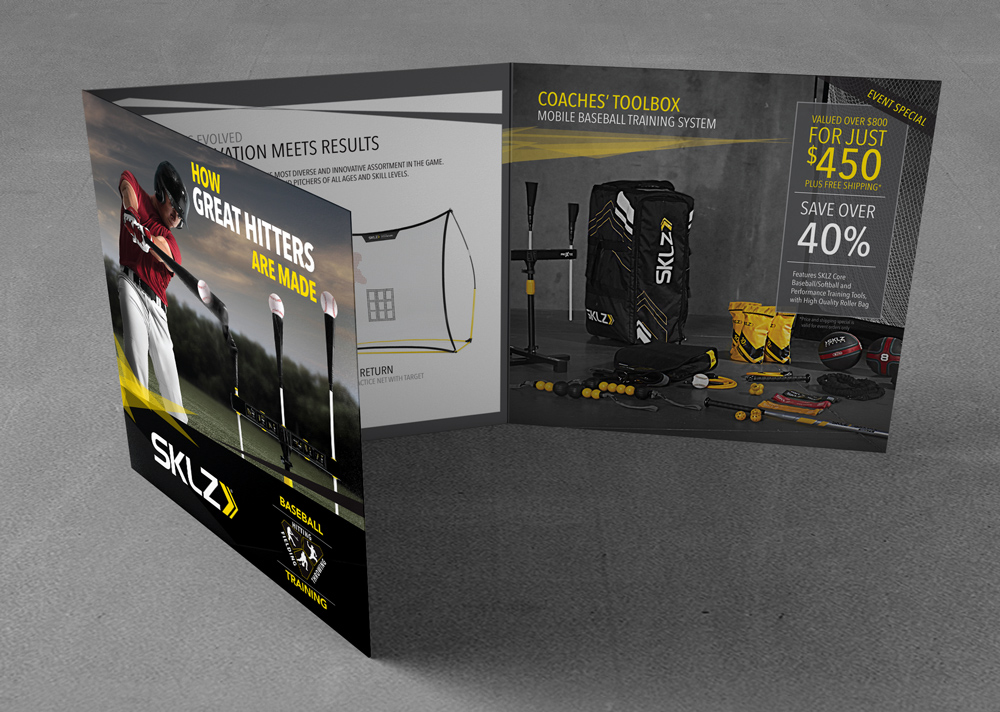
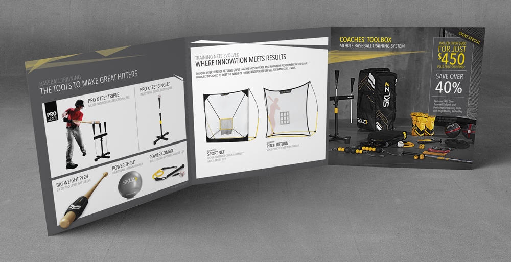
The above brochure was used for baseball trade shows that year. The hero product was shown on the cover, and was further featured on the first inside spread. The inside of the brochure gave further info about products that were seen at the show.
Retail Signage


Brand Continuity
The fractal look was the style for all company collateral. Below are piece that were for a trade show ad as well as more retail graphics.