Zion Topographic Designs
With the Client connection from the Sesame Street project, we worked on another race series collateral for a National Park Anniversary. They already had the medal design, and weren’t sure about what creative to use for the apparel. Designer enters stage left.
Concept Direction
In taking the small must haves from the client, I sketched a few ideas quick to start the direction. Visual references that influence, sketches and visual styles were used to convey the idea.
Creative Solution
FINAL FRONT
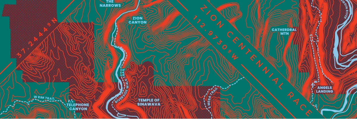
The Client had said they’d like to use the shape of the park in the design. Using this and the topographic build of the medal, I used public domain quadrangle topo maps available online. I figured to focus on the main line of attractions. I made it a diamond cause they’re more interesting than squares and trending. Around the design I found the longitude and latitude of the park.
With Screen print production in mind, the topo lines were all one color, and the water and trails another color. The shape of the park was below this.
FINAL BACK
The hardest part of this design was prepping for output to screens. In order for the location names to read well, they needed clearance from the lines. This required fantastic knowledge of the pathfinder tool, that drove me crazy. Other aspect of output was the lines needed to be a certain width to be able to be burnt on a the screen. From the original design, the detail below shows the thicker lines, and where the canyons are very steep the lines run together. At first we thought this was an issue, but when looked at in normal size it created a 3D effect.
the blended lines create a volume to the artwork
Part of the race collateral was a sticker. While I provided other layout options, the client wanted a direct take down of the t-shirt.
STICKER!
Freelance Lessons
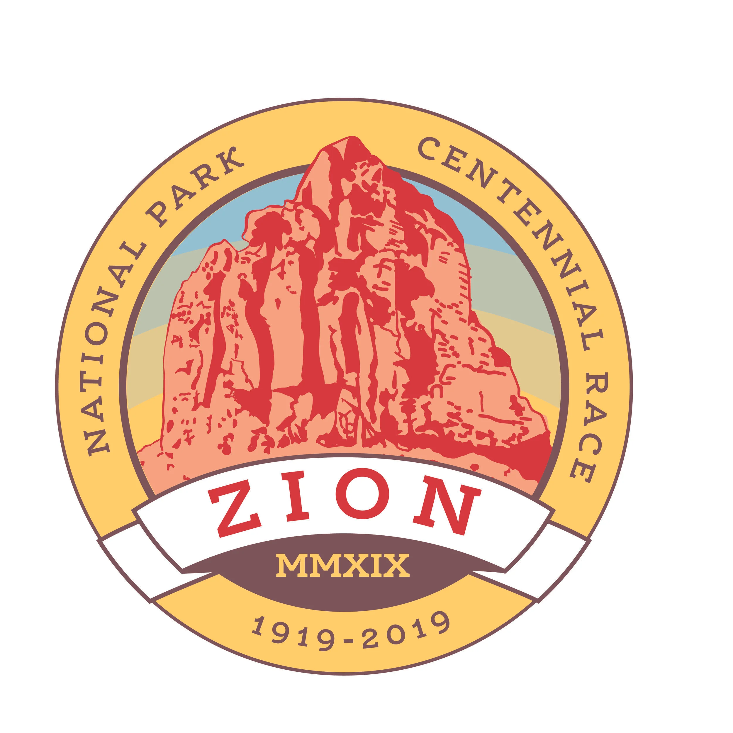
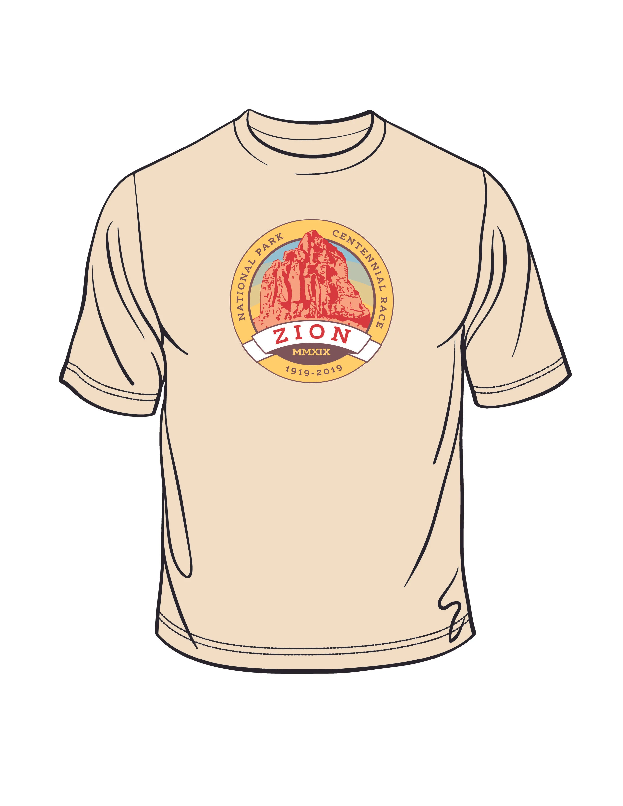
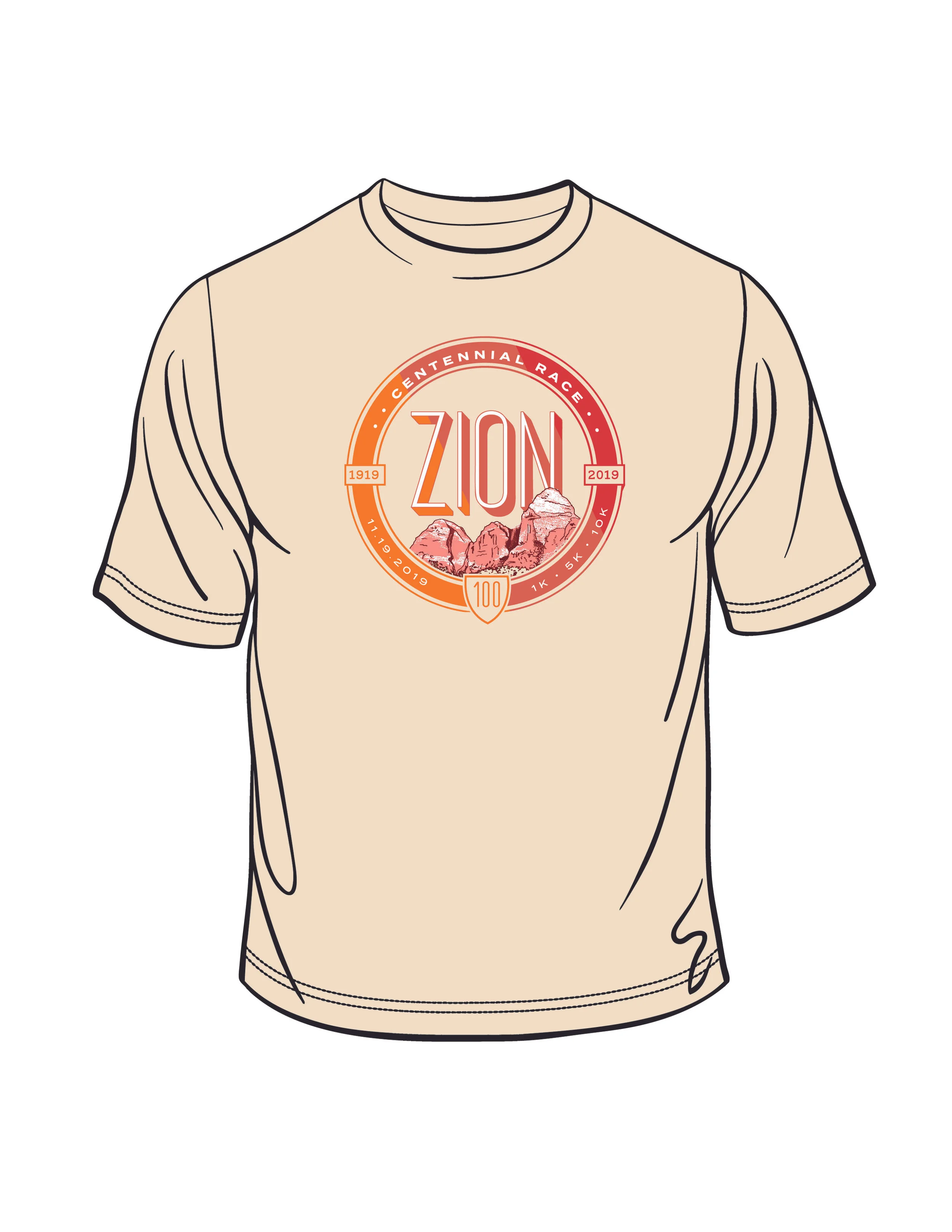
The design above took me very little time to get artwork to final state (output not including), I needed to appease my creative self, in thinking that there was another, better option. And this is where I learned my lesson, while the client was fine with the artwork, it was my own initiative to make more artwork. I suppose there was part that this was a new Client and I wanted to impress them. However, this thinking got me into a weekend worth of work that was ultimately not used by the client. As a freelancer, being sure that your time spent on a project reflects well the hours able to bill. In other words so your’e not working for a lower hourly rate. Anyways, these designs are great, and I’ll use them as stock/licensed art (one of these days).
Alternate Directions
CLICK TO VIEW LARGER
