Southwest Color & Form

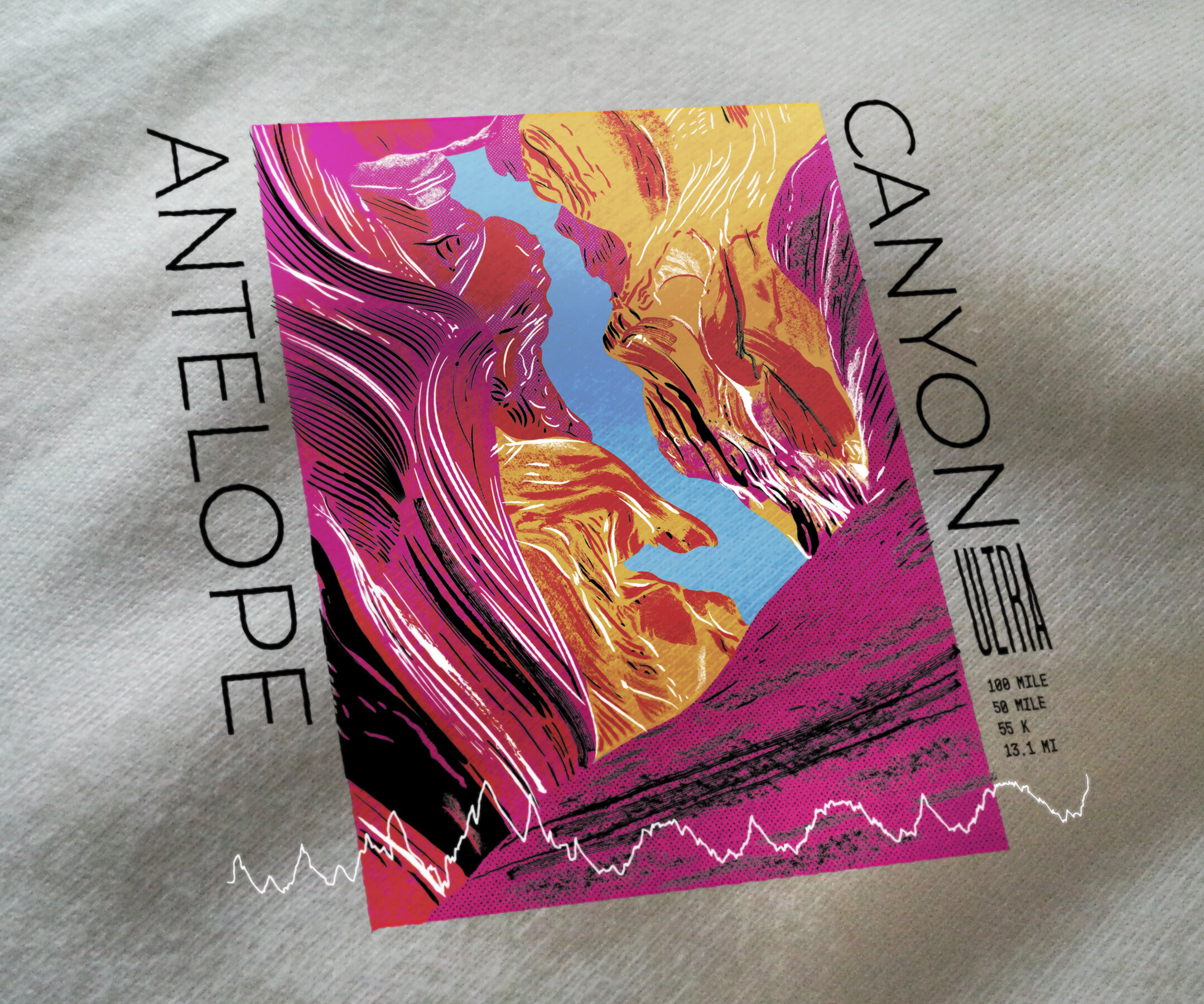
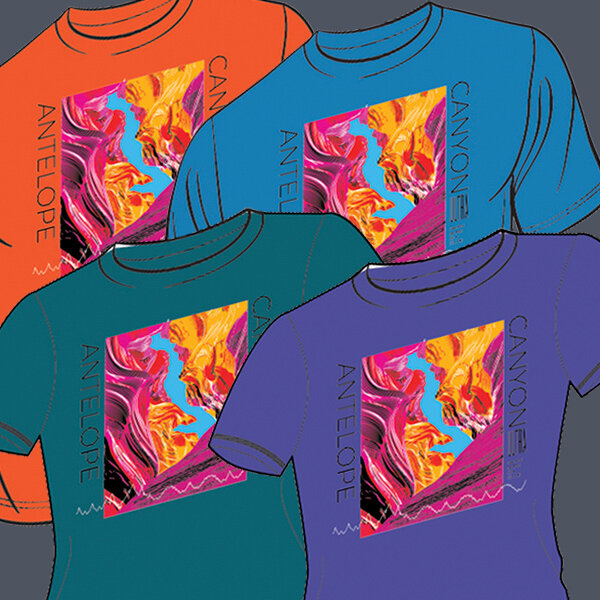
Antelope Canyon Ultra Race Series Apparel Illustration
An apparel illustration opportunity for a favorite client of mine, this drawing was the third and final project for some early 2020 projects. One of the Client’s races takes place near the National Monument Antelope Canyon- that’s just across the Utah border in Arizona.
“The canyon is known for its wave-like structure and the light beams that shine into the openings of the canyon, creating a supernatural appearance.”

Antelope Canyon is a difficult area to capture in an illustration. It’s a place where beauty isn’t in the large, sweeping vistas, but in the close, confined, undulating rock shapes that surround you. Some illustrations of slot canyons leaned on the negative space of the canyon, but unless you are familiar with what the landscape is, the shape looks very strange. Another challenge with this project is the media- screenprint. This limited production means presents a challenge on how to deliver artwork that is production-friendly, while figuring out how to visualize the idea in my head.
Some photos I came across had hyper-saturated colors, and seemed very early 90s design colors, with black grunge lines. For my first comp, I played with what a 90s style shirt design would look like.
FIRST DRAWING
The white zig zag like is the course elevations for their longest race. While I like the design, I thought the line styles were too varied. Also the rectangle shape wasn’t working for a shirt, and regardless of what shape I placed it in, it wasn’t meant for a shirt design. I tried to get them to use it as a poster or tote bag print instead- they look hot in that form!
New Inspiration
After lamenting the time spent in wasted efforts, I pulled up another found inspiration. I wanted to illustrate the lines and abstract shapes that make up the landscape. I found an old Japenese woodblock print that inspired a way to illustrate the cliff walls.

Illustration Process
I started by finding the black lines in the photo. I used a lot of Illustrators Blend feature to render the multiple, flowing lines within a shape (this part took a very long time- at this point I defiantly tapped out the desired hourly rate).
Developing Form


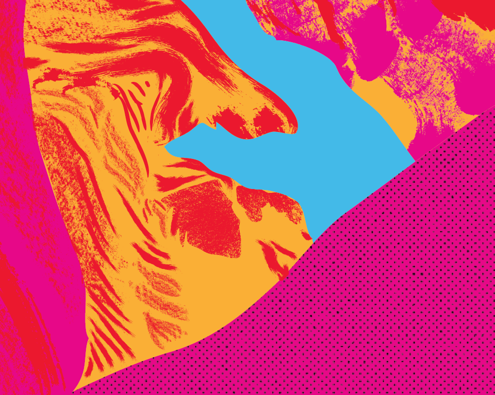
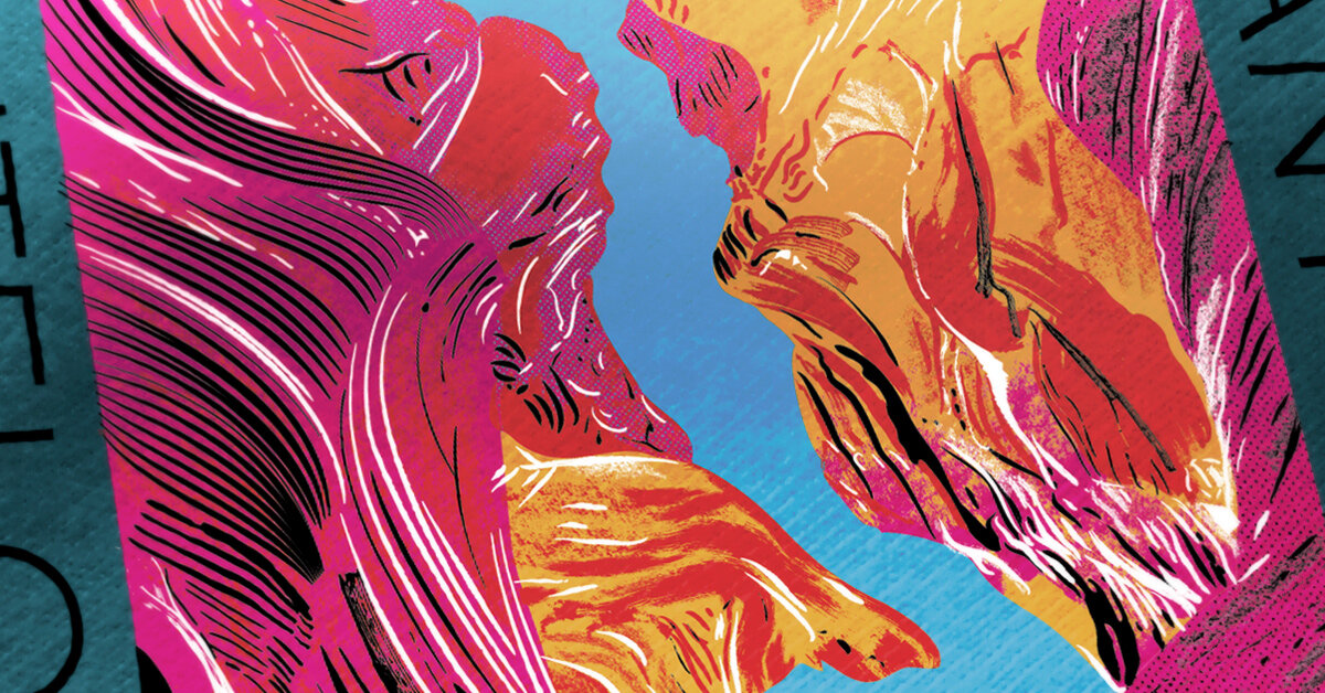
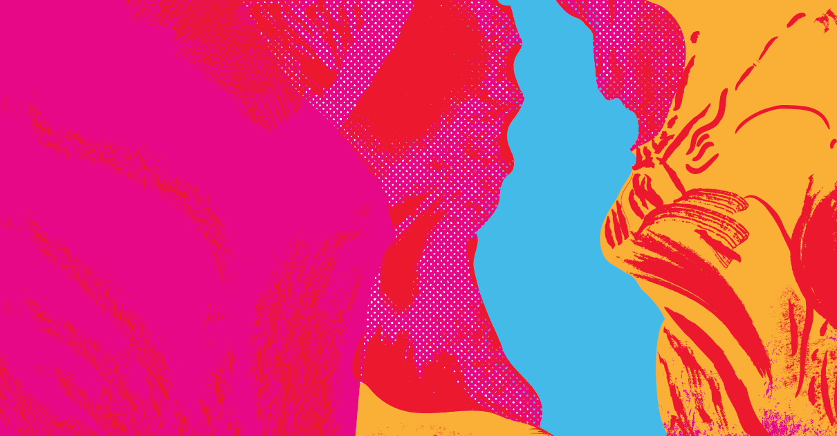
Developing color
Second step was drawing the color block shapes of the photo. Since this would be screen-printed, I could only use a max of 6 colors. Another challenge with this design, I wanted the printing to not have layers and layers of ink, which make the shirt feel like a bib. So the colors needed to not overlap, or have subtracted areas to reduce shirt-bib-feel.


This next step was the orange highlight lines on the rocks. A technique in painting is to move your brush as to have the brush strokes help convey the form. I used the same idea here, having the lines build to to contour the rock forms to bring volume to the area.
Made it work, ‘Atta Girl
The initial impression of the artwork from the client was very positive and excited. They thought I captured the area in a very unique way, that accurately represented the area while being an eye catching design. The couple things to change were to reduce the colors. If you click to view the image above, you’ll see the 7 color palette it used. We needed to keep the artwork at 5 (as a white undercoat would be used, making a max color of 6 ), so we illuminated the pink overlay on the red. This was fine because it would help alleviate the issue of printing ink on large areas of ink, the shirt-bib aspect. I also wanted to further reduce the ink laying down of the large color fields in the design by subtracting a grunge/spotted areas from the solid shapes. We also felt the type needed to be incorporated to the design- somehow.
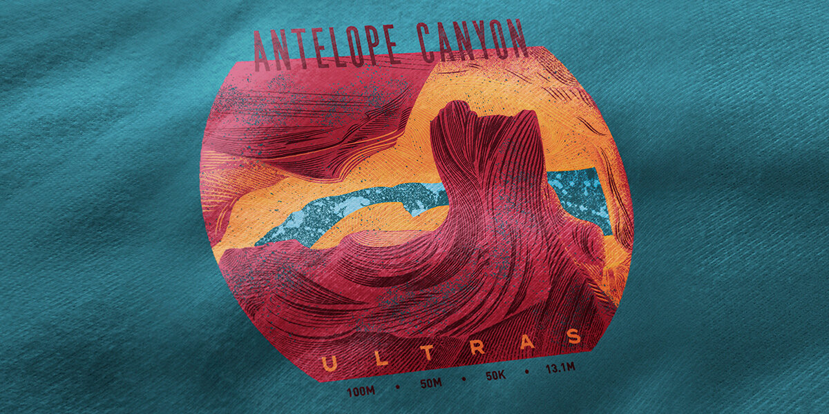
Final Illustration
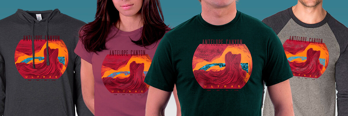
This was one of the Client’s last events before the Covid-19 crisis blew up. About a quarter of the registrants were not able to make it. The race did happen, and