Branding Baseball BBQ
A Case Study in Strategy, Storytelling, and Spirit
In 2019, Baseball BBQ approached me with a unique challenge: create a brand identity that blended America’s favorite pastime with the ritual of backyard grilling. It wasn’t just about logos and colors — it was about building a personality that could live on packaging, apparel, stadium shelves, and ultimately in the hands of fans.
The Project Brief
Baseball BBQ needed a full brand system that celebrated their niche: handcrafted BBQ tools shaped like baseball bats. The brand had to speak to loyal fans of both the game and the grill — bold, approachable, and instantly recognizable.

Initial product offering
Research & Insights
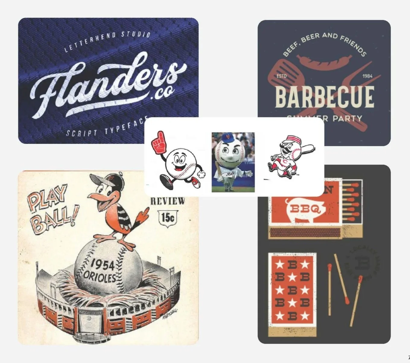
Before sketching, I dug into fan culture. Baseball is more than stats and uniforms — it’s a lifestyle rooted in community, nostalgia, and tradition. BBQ, on the other hand, brings in a sense of warmth, camaraderie, and ritual. Those shared values of gathering, storytelling, and pride became the foundation of the brand.
The Challenge
The overlap of baseball and BBQ feels natural, but visually marrying the two worlds required careful balance. Too much baseball, and it would feel like novelty merchandise. Too much BBQ, and the sports angle would get lost. The sweet spot was creating a brand mark and system that felt both timeless and playful.
Research & Insights
Concept Development
The design process went through multiple rounds of brand mark explorations — balancing script typography with bold marks, testing how icons could flex across print and digital, and ensuring legibility at small scales like hang tags.
Brand Mark Development
Round 1
I provided several comps that aligned script typography inspired by baseball, to build an immediate connection with the audience.
Early rounds focused on refining how much detail was needed without overwhelming the mark.
Drafted several arrangements of shapes or lock-ups that paired home plate and bat-handle shapes to connect to the product.

Round 2
From previous lock-up, we removed the flame as the name was changed to Baseball BBQ.
In refining for less elements, the home plate was enlarged to use as a crest.
More refinements on brand script use

Round 3
This point needed to explored the effect of the mark being laser engraved into the product, determining the stroke and shape thickness for the whole mark.
Updates were needed to match real home plate dims.
After these edits, how the mark incorporated with the script was determined for the several instances the script logo would be needed.
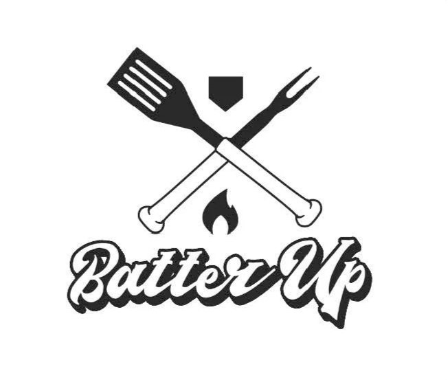
Final Brand Mark

Final Brand Logo

Logo application on handle end
Throughout the process, I worked to ensure that the logo system was not only flexible for packaging, apparel, and digital use but also carried a playful spirit that would resonate with fans. This blend of baseball tradition and grilling became the foundation for the brand mark.
Brand Character Development
Characters were developed to give the brand a human, fun voice that could engage audiences beyond the logo.

Defining Direction
Initial steps was determining the style that would best align with the audience.
Several inspiration images were provided, and sketches of how this would apply to the “ForkBaller” character face.

Round 1
With the style defined, these explorations focused on developing the visual style and proportion — balancing style with product incorporated, with animated feel.
Incorporating details like the baseball seams, cap styles, and mustache added individuality and made the character memorable, while ensuring the tools were integrated without overshadowing the figure.

Round 3
Final edits were adjusting minor positioning, shoe style, and facial consistency.
Final Characters

These characters gave the brand a flexible storytelling tool that could adapt to different applications, from product packaging to apparel. The character identity not only reinforced the connection to baseball but also helped bring fun, humor, and energy to the brand’s visual system.

Brand Guidlines - 1 pager
Execution & Applications


Hang Tags & Packaging: Designed to feel collectible yet functional, nodding to baseball card culture while keeping retail-ready clarity.
Apparel: Graphics that let fans wear their passion for the game and the grill.
Digital Presence: A consistent online look that carried through social, web, and digital campaigns.
Stadium Retail: Merchandise displays designed for impact in high-energy sports venues.
Results
Baseball BBQ launched with a strong, cohesive brand identity that not only elevated their retail presence but also built emotional resonance with fans. The playful yet strategic brand system made them stand out in both the sports and culinary spaces.
For me, this project was about more than logo design — it was about weaving together two great American traditions into a unified story. Baseball BBQ continues to thrive because the brand celebrates what people love most: community, connection, and a little bit of fun.